News How a Beauty Brand Boosted Shelf Appeal with Bold Label Design
<
How a Beauty Brand Boosted Shelf Appeal with Bold Label Design
In the competitive world of beauty products, first impressions are everything. With so many brands fighting for attention, standing out on the shelf isn’t just nice to have; it’s essential. One of our clients, an emerging beauty brand, recognised this challenge and transformed its packaging strategy with our help, achieving impressive results.
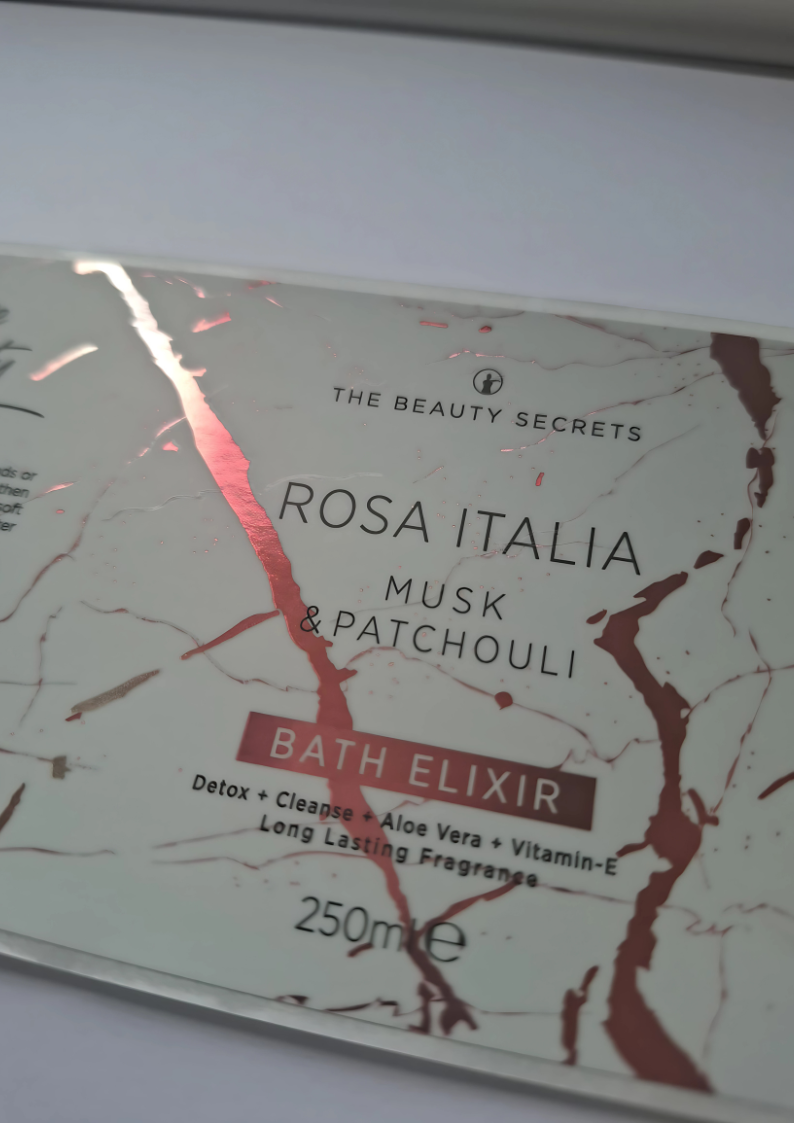
The brand, known for its natural skincare range, had already built a loyal customer base. But in busy retail settings, their products often blended in with similar-looking items. While their minimalist design was elegant, it didn’t grab the attention of new shoppers.
We worked closely with the brand to completely refresh its packaging. The goal was to create labels that reflected their ethos but also stood out on the shelf. The key changes we introduced included:
Vibrant Colours: Inspired by nature, the new labels featured bright, bold colours that tied in with the brand’s natural ingredients.
Clear Typography: We made sure the product details were displayed in a clean, easy-to-read style, so shoppers could quickly find key information.
Enhanced Finishes: We added glossy and textured elements to give the labels a premium look and feel, making the products more inviting to pick up.
As label specialists, we provided a full package of services and products to meet the brand’s needs:
Peel and Reveal Labels: These multi-layered labels allowed the brand to include extra information, directions and full ingredient lists, without cluttering the main design.
Sustainable Labels: We supported the brand’s eco-friendly mission by supplying biodegradable labels that were durable and attractive.
Bespoke Design Service: Our design team worked hand-in-hand with the brand to create custom designs that expressed their identity and appealed to their audience.
After the relaunch, the brand saw a strong increase in customer engagement and sales. Retailers told us that shoppers were picking up and inspecting the products more often, all thanks to the bold new labels. The collaboration not only enhanced the brand’s shelf presence but also strengthened its overall market position.
Conclusion
This case study highlights the real impact that thoughtful label design can have in the beauty industry. By partnering with us, the brand successfully navigated the challenges of a crowded market, proving that smart, strategic packaging is a powerful tool for brand growth and success.